Loading the page ...
Frans Hogenberg
(c. 1540 Mechelen – c. 1590 Cologne)
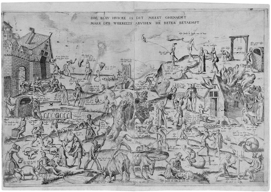
Die blau huicke is dit meest ghenaemt / Maer des weerelts abuisen het beter betaempt. Etching from two plates. 37.8 x 56.8 cm. Circa 1558. Nagler, Die Monogrammisten II, 2169. Watermark: Post horn.
This highly unusual portrayal by Frans Hogenberg of forty-three Flemish proverbs is as rare as it is important in art historcal terms. One might go even further and say that the epithet "rare" in this case is probably a genuine understatement, as the etching is practically impossible to find! Ursula Mielke, author of the forthcoming, impeccably researched volume on Hogenberg in the New Hollstein series, is aware of the existence of only one other impression, which is kept in the Bibliothèque Royale in Brussels (Inv. no. F 16039). There had been another example, albeit comprising only the left half of the print, in the Berlin Kupferstichkabinett, but it was lost during the Second World War.
The Belgian art historian Louis Lebeer deserves the credit for being the first to subject Hogenberg’s collection of proverbs to a thorough historical and iconographic examination in an essay published in 1939. The rarity of the etching is proved by the fact that the author referred in his article to the incomplete impression in the Berlin Kupferstichkabinett (see L. Lebeer, "De Blauwe Huyck", Gentsche Bijdragen tot de Kunstgeschiedenis, 6, 1939–40, pp. 161–229). The great historical significance of the print lies in the fact that the etching was done at roughly the same time, if not immediately before, Bruegel’s famous 1559 painting The Netherlandish Proverbs (Berlin, Gemäldegalerie SMPK), thus marking a decisive moment in the development of Dutch genre printmaking. In view of the stylistic analogies with a group of engravings published by Bartholomeus de Momper in Antwerp in the late 1550s, Lebeer puts the date of our etching at c. 1558. As the author persuasively argues, Hogenberg’s etching is the prototype of a new pictorial tradition in the southern Netherlands which was soon to become very popular and remain so well into the next century. Lebeer describes a number of variants of Hogenberg’s original version, one of the most remarkable examples being Jan van Doetecum’s engraving of 1577 (The New Hollstein 790), which on four plates presents no fewer than eighty-eight proverbs!
It is a veritable feast of human follies, abominations and aberrations that Hogenberg serves up to us in a plain, unvarnished and drastic manner. Men and women of all ages, peasants and townsfolk, populate a barren, almost treeless landscape and appear to be rashly pursuing vain or foolish enterprises that are clearly doomed to disaster. Hogenberg depicts a burlesque and chaotic scene of confusion, and the beholder is, as it were, drawn into the maelstrom of all this noise and bustle. The cryptic title Die blau huicke (The Blue Cloak) conceals a comprehensive inventory of moral turpitude, as exemplified by then prevalent proverbs and sayings. At the centre of it all is the theme of the "topsy-turvy world", a symbol of the absurdity and sinfulness of human endeavour that expresses a mocking, moralizing view of the world of the kind also encountered in the contemporary "Rederijkers" (Rhetoricians’) literature. As in Bruegel’s painting, we see in the left foreground a woman helping her husband on with his blue cloak ("huick"), acting out a folk saying that identifies her as an adulteress. In the 16th century the fussing woman was seen as a classic example of the topsy-turvy world. It is interesting to note that both Hogenberg and Bruegel present a large number of identical proverbs. Thus we see – to name two conspicuous examples – to the right of the adulterous woman a man who "is filling in the well after the calf has drowned", a metaphor for the futility of human endeavour, while in the right foreground the saying "to light a candle to the Devil" is illustrated as a symbol of human lust for gain, the dedication to a false cause. All these sayings without exception were part of the general culture of the time, and their significance was comprehensible to everyone. It is a remarkable testimony to cultural continuity that many of these sayings are still in common use today, exactly four hundred and fifty years later.
Seen from an artistic and formal perspective, the two works differ considerably. This is not surprising when we take into account that our print was a youthful work of the then eighteen-year-old Hogenberg, whereas in 1559 the great Bruegel was at the height of his fame. While Bruegel in his painted masterpiece succeeds in achieving a clear and well-ordered compositional structure despite the impressive number of over a hundred proverbs, Hogenberg only manages a loose accumulation of individual scenes spread over the sheet with no apparent logic, which lends the portrayal a folk-like character. A certain preference for crude and earthy sayings reinforces this impression. The etching technique used by Hogenberg is correspondingly rudimentary, indeed almost rough and ungainly. His repertoire of graphic abbreviations is very limited and consists of vigorous, rough cross-hatchings, small strokes and simple parallel lines, while individual details are picked out in dry point. Consequently the density of the line-work changes frequently, creating an unsettling, flickering effect. Hogenberg’s figures appear spindly, almost naive, although they are very vividly characterized with plenty of humorous expression. In comparison to the graphic reproductions after Bruegel, which were executed in a solid engraving technique by experienced masters from the studio of Hieronymus Cock, Hogenberg’s freer etching style permits a larger measure of spontaneity and colour. Prints of this kind, which in the directness of their message are reminiscent of leaflets, were designed for a broad public and could not be expensive to make. As they were intended for everyday use and mounted on wooden boards or pinned to the wall, only individual copies have survived, despite their great popularity. This makes it all the more gratifying to be able to offer such an early and rare example of Flemish genre printmaking which is moreover in mint condition and superior in quality to the Brussels impression.
A superb, sharp and richly contrasting early impression, printed with a delicate plate tone. With margins at top and below; otherwise with thread margins around the platemark or partially trimmed to the platemark. Slight traces of handling, otherwise in excellent, unrestored condition.